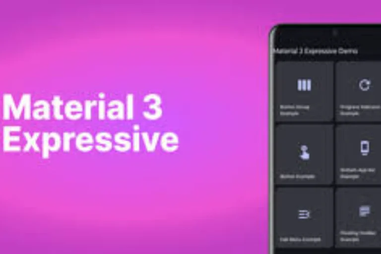
Google has virtually unveiled a new appearance to its stock Phone app in Android phones. The update has the brand new Material 3 Expressive design language that makes the dialer look cleaner and modern. Many users are, however, caught unawares by the abrupt updates and are often interested in knowing how to use or even reverse the update.
What is New in the Phone App?
The redesign focuses on making calling simpler, but not everyone is happy with the changes. Here is what has changed:
- Home Tab: The new Home tab combines Favourites and Recents so you view regularly contacted people along with recents in the same screen.
- Keypad Positioning: Fixed keypad tab has replaced the floating position of the dial key.
- Contacts Tab Deleted: The tab that particularized contacts has become a menu option through three dots at the top.
- Gestures: Whether one is receiving a call or not, they now have the option of accepting the call by either swiping horizontally, or tap once to reject it
How to Get Used to the Update
- Open the Phone app and explore the new Home tab for quick access to both contacts and call history.
- Use the bottom keypad tab whenever you want to dial numbers manually.
- Tap the three-dot menu in the top-right corner to search or browse your contacts.
- If you prefer tapping instead of swiping (or vice versa) for calls, go to Settings > Incoming call gesture to choose your style.
How to Revert to the Old Design
If you find the new interface confusing, you can roll back to the previous version in two simple ways:
Method 1:
- Go to Settings > Apps > Phone > Storage
- Tap Clear Cache
- Select Uninstall Updates
Method 2:
- Open the Google Play Store
- Search for Phone by Google
- Tap the three-dot menu (top right)
- Select Uninstall Updates
- Restart your device
Read: Google Pixel Pro vs Samsung S25 vs iPhone 17 Pro – Price, Features, and Specs Compared
The redesign falls under the Material 3 Expressive update which Google is rolling out in other products such as Gmail, Google TV and Google Clock. Although the cleaner appearance is supposed to make the life of people doing the job easier and avoiding accidental moves, most of the users complain about the new interface, saying it is blocky and confusing.
Google has accepted this feedback and it is possible that soon the user will get more freedom of choosing preferred layout.


